Web Story taxonomy


Web Stories have a similar look as full-screen tappable experience in some social apps, but persist on the open web to be discovered, shared and loved by your audience for more than 24 hours. This guide introduces you to the taxonomy of a Web Story and best practices when creating one.
A Web Story is made of 3 main parts:
- Poster
- Cover Page
- Story Pages
Web Story poster
Your Web Story’s poster is one of the most important factors in whether users will decide to engage with your content: it’s the first thing users will see on places such as a Google Search result or in the Discover carousel. Essentially, it’s your Web Stories packaging, and it should be delightful and enticing.
Background image
When selecting a background image for your poster, keep in mind the following guidelines:
- Use a high quality static image. Videos and animations are not allowed.
- Ensure it is at least 640x853 pixels large
- Check that the aspect ratio is 3:4.
- The title of your story, your publisher name and publisher logo are automatically placed and displayed on the lower third of your poster. This means you shouldn’t embed any of these onto your poster background image.
- Ensure the most engaging part of your poster’s imagery is in the upper two thirds. This way the automatically added elements won’t obscure important details.
- Avoid burned-in text on your poster images. It may be visually confusing to viewers and search engines won’t be able to crawl it.
Title
Titles help users understand what your narrative is about.. We recommend a title that is shorter than 70 characters that follows our best practices for creating a descriptive title. The title of your story, your publisher name and publisher logo are automatically placed and displayed on the lower third of your poster. Do not burn the title of your story into the background image.
Publisher logo
The publisher logo is a small square icon that represents you, your brand, or your company. Your publisher logo must be at least 96x96 pixels large, and have a 1:1 aspect ratio.
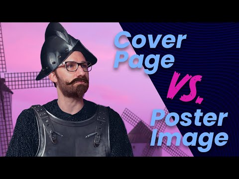
Cover Page
The cover is the landing, or first page of your Web Story. If a user lands on your cover that means your poster image caught their attention, congratulations! The next step is keeping them engaged.
In many cases, a poster image and cover page will look similar. However, the cover page has much fewer restrictions than the poster image. Instead of one static image, you now have full use of video, audio and animations. While you can change your cover page completely from the poster image, it’s best to ensure that users feel like the story they tapped or clicked into matches the poster.
Story Pages
This is where your narrative really begins. Start building your beginning, middle and end. Create pages by layering video, text and other assets to create visually engaging experiences.
To be distributed by Google, each Web Story must be a minimum of 4 pages and ideally less than 30. The best Web Stories are well told and easy for readers to follow. With that, if your narrative calls for more than 30 pages, go for it! Or, consider breaking it up into smaller Web Stories and start a series.